UI/UX Design • Workflow Design • User Research • Design Systems • Product Design
After a year of working closely with the product team and observing how users navigated the platform, it became clear that several workflows had gradually evolved into disconnected experiences with inconsistent patterns, layouts, and navigation. The challenge was not only to simplify the system, but to do so in a way that reduced friction without disrupting the workflows users had already become familiar with.
I led the redesign effort to consolidate five separate workflows into a unified experience, focusing on clearer hierarchy, improved consistency, and a streamlined interface that better supported the way users actually worked within the product. The result was more than a redesign—it created a flexible foundation that continues to grow alongside the platform, allowing new workflows and legacy experiences to be brought into a shared system over time.
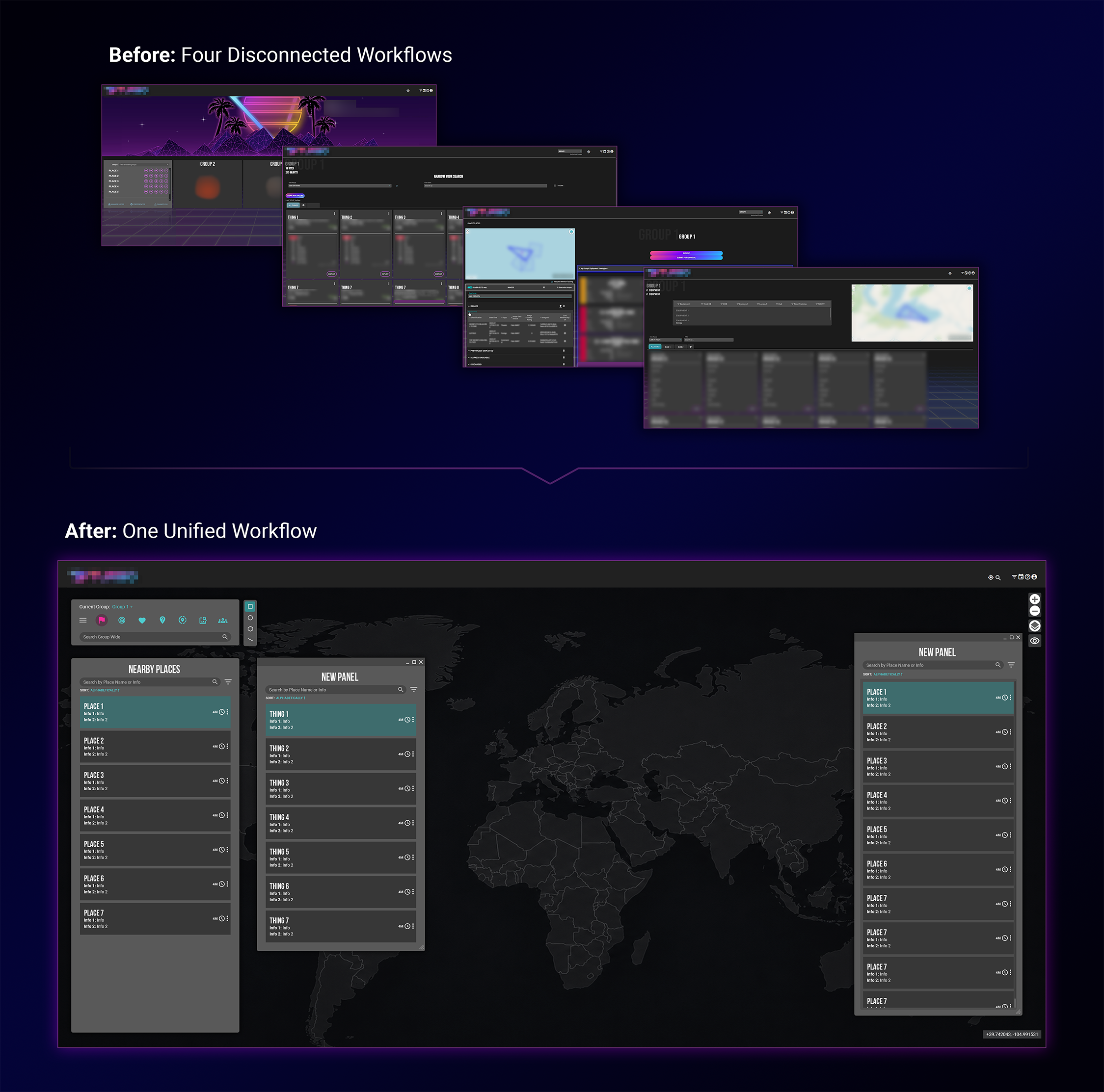
After spending a year working with the platform, it became clear that five separate workflows spread across six applications were often solving similar problems in different ways. While each workflow had evolved to meet specific user needs, they shared many of the same patterns, actions, and goals. The challenge wasn’t simply to redesign the interface—it was to create a scalable foundation that could reduce complexity while preserving the familiarity users relied on every day.
I began by auditing the existing workflows and mapping how users moved between applications to complete common tasks. Through user observations, stakeholder discussions, and collaborative reviews with the product team, we identified areas where functionality overlapped and where repeated navigation, context switching, and duplicated interactions were creating unnecessary friction. These insights helped establish a clear vision for a more connected experience.
Rather than starting from scratch, the team focused on preserving the workflows and interactions users already understood while bringing related functionality together into a shared workspace. Over the course of the project, we explored dozens of concepts and created roughly 60 interface iterations to determine how information could be consolidated without sacrificing clarity. There were certainly opportunities to make more dramatic changes, but maintaining familiarity was a deliberate decision. The goal was to simplify the experience, not force users to relearn how they worked.
As new workflows continue to be introduced and legacy experiences are brought into the system, the unified framework continues to evolve alongside the product. By establishing shared patterns, reusable components, and a consistent interaction model, the project created a foundation that supports both current workflows and future growth.
Workflow Fragmentation
Over time, the platform had grown into a collection of specialized workflows spread across multiple applications. While each workflow had been developed to solve a specific problem, many of them shared similar functionality, navigation patterns, and user goals. As the platform evolved, these experiences gradually became disconnected, requiring users to switch between applications to complete related tasks.
By reviewing existing workflows side-by-side, it became easier to identify areas of overlap and repeated interactions. Similar actions were often performed through different interfaces, creating unnecessary complexity and increasing the amount of context switching required to complete everyday work. Understanding where these experiences diverged became the foundation for determining where they could be brought back together.

Workflow Mapping & Discovery
Before exploring solutions, I worked closely with the product team to better understand how users navigated the platform and how different workflows related to one another. Through workflow audits, stakeholder discussions, and observations of common user tasks, we mapped how information moved between applications and identified areas where users were repeatedly performing similar actions in different environments.
This process revealed opportunities to consolidate related functionality while reducing unnecessary navigation and duplicated effort. It also helped establish which workflows could be unified immediately and which would require a more gradual transition as the platform continued to evolve.
Early Concept Exploration
With a clearer understanding of the problem space, I began exploring multiple approaches for bringing these workflows together into a shared experience. The challenge was not simply determining what information should be consolidated, but how to organize it in a way that felt intuitive to existing users while supporting future growth.
We evaluated dozens of concepts and created roughly sixty interface iterations, experimenting with navigation models, panel structures, information hierarchy, and workspace layouts. Throughout this process, every concept was measured against the same goal: simplify the experience without forcing users to relearn the workflows they depended on.
Building a Shared Experience
Rather than redesigning every interaction from scratch, the team focused on identifying common patterns that could be reused across workflows. Shared navigation, standardized layouts, reusable components, and consistent interaction models helped create a more cohesive experience while preserving the familiarity users had built over time.
This approach transformed the project from a workflow consolidation effort into a scalable framework for future growth. As new workflows are introduced and legacy experiences are modernized, they can be integrated into the shared system while maintaining a consistent and predictable user experience across the platform.
Solution/Results
The final redesign transformed five separate workflows into a more unified experience, giving users a single workspace for tasks that had previously been spread across multiple applications and interfaces. By consolidating related functionality into one system, users could access the tools and information they needed without constantly switching contexts or navigating between disconnected workflows.
A major focus of the project was improving consistency without sacrificing familiarity. Shared navigation patterns, reusable components, and standardized layouts helped create a more cohesive experience while preserving many of the interactions users had already learned over time. This approach reduced unnecessary complexity and helped make the transition to the new system feel intuitive rather than disruptive.
Beyond improving the day-to-day user experience, the redesign established a scalable foundation for future growth. Rather than creating a solution for a fixed set of workflows, the unified system was designed to continue evolving alongside the product. As new workflows are developed and existing experiences are modernized, they can be integrated into the shared framework, allowing the platform to grow while maintaining a consistent and predictable user experience.