Visual Design • Brand Design • Content Design • Design Systems
Malware isn’t exactly the friendliest subject matter. This Week in Malware was a recurring Sonatype series that broke down the latest malware discoveries and security threats for a developer audience, and it needed a visual identity that could make a pretty technical topic feel more approachable.
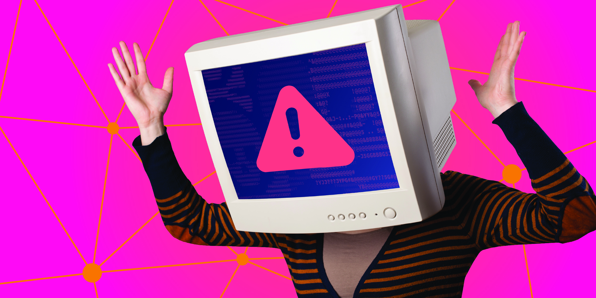
I developed a playful visual system built around illustrated characters, bold colors, and modular layouts that gave the series its own recognizable personality. Because new content was released every week, I designed the system to be flexible from the start, making it possible to create fresh graphics quickly without reinventing the visual language for every new story.
The Challenge
A weekly series comes with one very practical problem: you need a lot of graphics.
Each new story covered a different threat, vulnerability, or malware discovery, but the series still needed to be recognizable from one week to the next. The visuals also had to strike the right balance between playful and credible. The goal wasn’t to make security threats feel trivial, but to make dense technical content a little less intimidating to engage with.
I needed to create a system that could support a constant stream of new topics without every graphic looking identical or requiring a completely new concept each week.
Buillding a Repeatable Identity
I started by developing a visual language around playful, monitor-headed characters that could represent different situations without tying the series to a single story or threat. Characters, expressions, poses, props, backgrounds, and supporting graphics could be mixed and matched to create new scenes while keeping the overall identity recognizable.
Bold colors and simple compositions helped the graphics stand out at smaller sizes, while recurring typography and layout patterns connected the different pieces across the series. The system was designed to work across thumbnails, social graphics, headers, and other promotional formats without losing its personality.
Rather than creating a rigid template, I built a set of reusable pieces that could be rearranged and adapted as the subject matter changed. That gave each week’s content room to feel different while still making it immediately recognizable as This Week in Malware.
Keeping it Fresh Week After Week
The modular system gave the Developer Relations team a consistent foundation for producing new This Week in Malware content. Reusable characters, layouts, and graphic elements streamlined production while still leaving enough flexibility to respond to whatever wonderfully terrible thing malware was doing that week.
The result was a recognizable identity that could grow with the series without becoming repetitive. Instead of starting from scratch for every release, the team could build from an established visual language while keeping each week’s content distinct.