Visual Design • Event Branding • Campaign Design • Brand Exploration • Design Systems
All Day DevOps is a free, 24-hour virtual conference that brings together developers and DevOps professionals from around the world. With speakers, sessions, and programming running continuously across multiple tracks, the event needed a visual identity that could bring a large amount of content together without making everything feel the same.
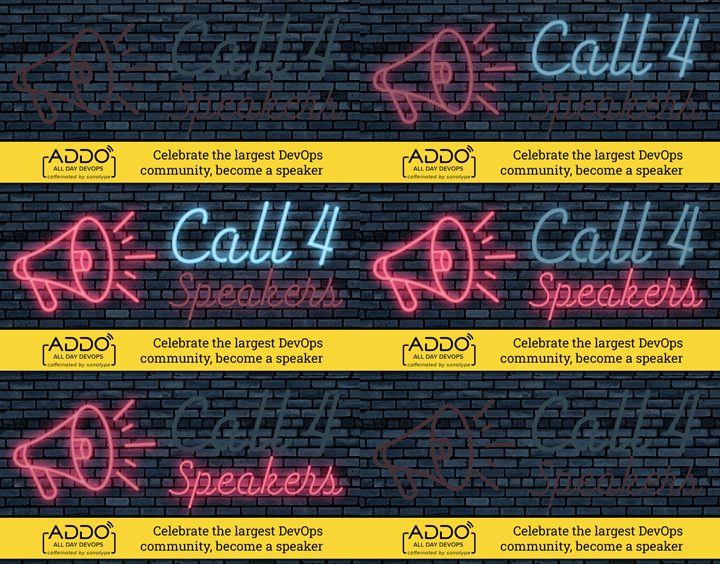
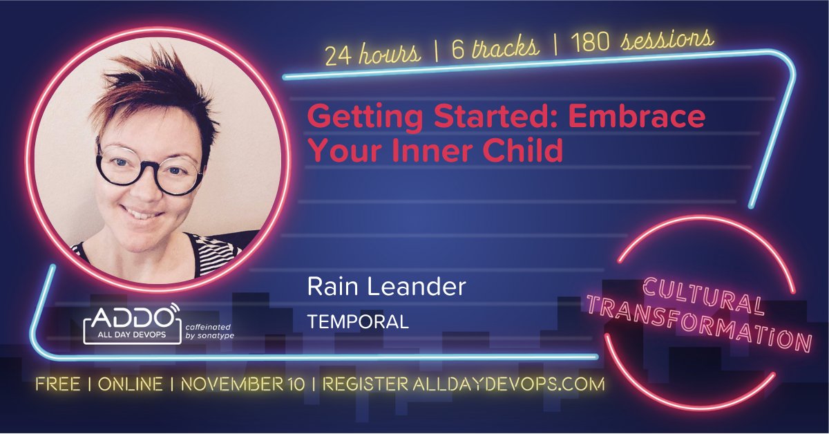
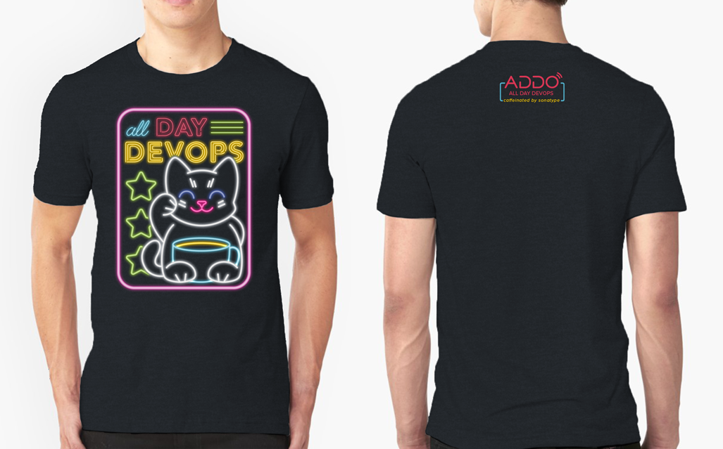
I developed a neon-inspired design system that gave each track its own color identity while connecting the event through shared typography, layouts, and graphic treatments. The system extended across speaker and session templates, social content, broadcast graphics, event materials, and other promotional assets, creating a flexible foundation for dozens of individual pieces.
The Challenge
A 24-hour global event produces a lot of content. ADDO needed to support multiple tracks, speakers, sessions, promotions, and broadcast materials while still feeling like one cohesive experience.
The challenge was to create a system with enough structure to keep all of those pieces connected, but enough flexibility to give individual tracks and content their own identity. It also needed to be easy to apply repeatedly as new assets were created throughout the event cycle.
Building the Visual System
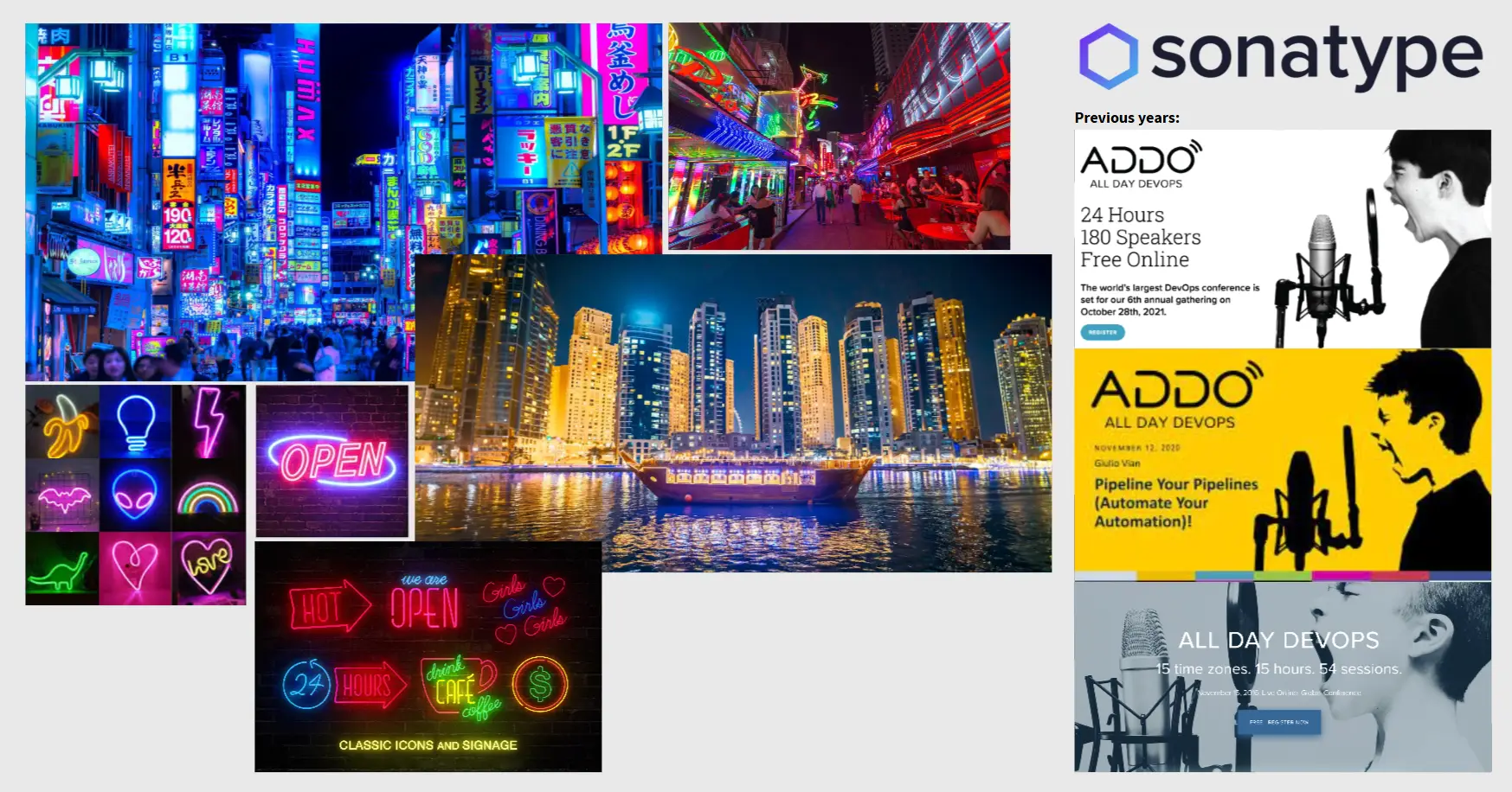
The fact that ADDO runs continuously for 24 hours became the starting point for the visual direction. I explored ways to give the event a sense of energy and movement, eventually developing a neon-inspired aesthetic that worked naturally with Sonatype’s existing color palette.
Color became the foundation for organizing the event. Each track was assigned a distinct color, making it easier to distinguish different areas of programming while shared typography, glow treatments, layouts, and graphic elements kept everything recognizably ADDO.
From there, I built the visual language into a reusable system of speaker and session templates, social graphics, broadcast assets, event materials, and other promotional content. Templates were designed so others could produce new assets while maintaining the same visual hierarchy and brand consistency throughout the event.
One Event, One Visual Language
The final system gave ADDO a recognizable identity that could scale across a large volume of content without losing consistency. Color-coded tracks helped organize the event visually, while the shared neon language connected everything from individual speaker graphics to the larger broadcast experience.
The reusable templates also allowed additional assets to be created without rebuilding the visual language each time. What began as a visual refresh became a flexible system that could support dozens of assets, multiple contributors, and the evolving needs of a 24-hour global event.