Process
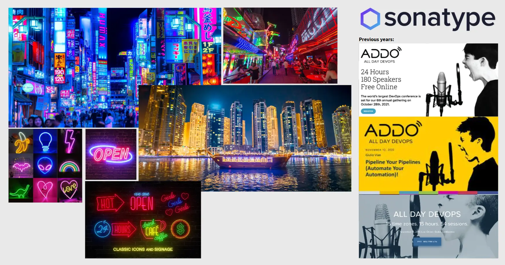
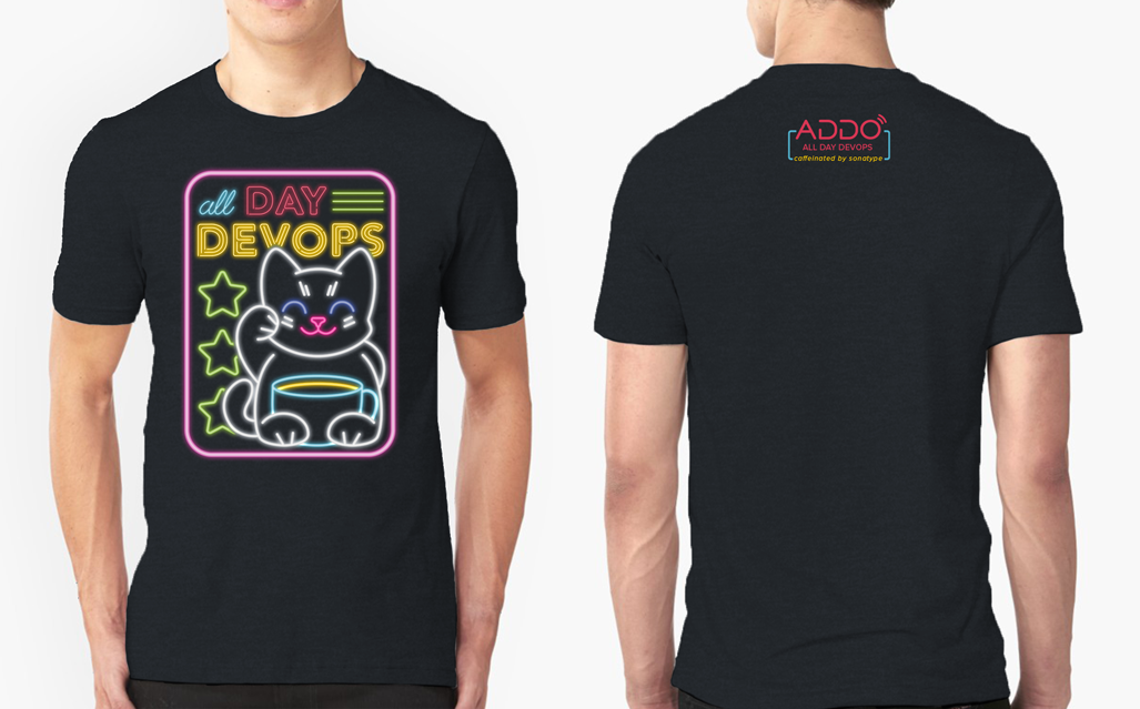
I began by exploring how to visualize the concept of “always-on innovation” — the idea that the event never sleeps. After experimenting with several directions, I landed on a neon-inspired aesthetic that symbolized energy, creativity, and connection across time zones.
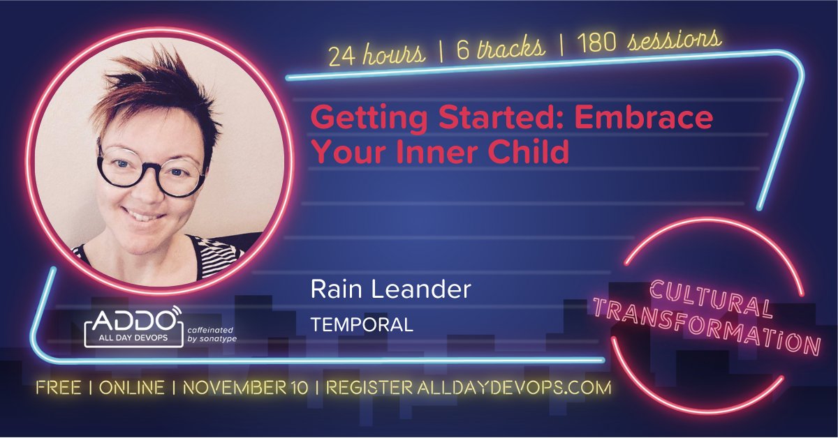
Each glowing color within the Sonatype brand palette took on new meaning, representing a different track or theme throughout the event. This not only created a strong visual rhythm but also helped attendees quickly identify sessions of interest.
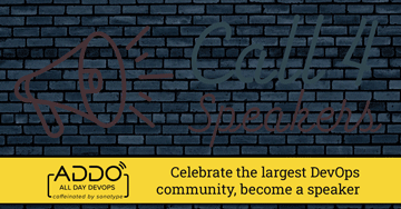
I collaborated closely with the marketing and events teams to roll out the updated visuals across digital materials, social media, and broadcast graphics — ensuring that every touchpoint carried the same lively, unified energy.
Solution/Results
The refreshed branding immediately transformed the perception of ADDO. The neon aesthetic gave the event a bold, contemporary feel that resonated with a diverse, global audience. The use of color-coded tracks brought clarity and organization to the packed 24-hour schedule, making navigation simple and engaging.
The new design direction was met with overwhelmingly positive feedback from both internal teams and participants. It reinvigorated the event’s presence, helping ADDO stand out in a crowded virtual landscape while strengthening its identity as a celebration of innovation and connection.
The success of this project reaffirmed my passion for transforming complex, large-scale experiences into cohesive, vibrant visual systems that bring people together — no matter where they are in the world.