UI/UX Design • Workflow Design • User Research • Design Systems • Product Design
The Correlation Rules Engine (CRE) was designed as a shared tool for building and managing rules across multiple programs. Users needed the flexibility to create everything from simple conditions to deeply nested rule sets, without the interface becoming increasingly difficult to navigate.
The original builder supported complex logic, but the more complicated a rule became, the harder it was to follow. Each additional layer of nesting pushed the actual content farther across the screen, making it difficult to see how rules related to one another.
I redesigned the interface to make those relationships easier to understand while keeping the flexibility the system needed. The focus was on improving visual hierarchy, simplifying interactions, and creating a more consistent experience that could work across different programs.
All sensitive information shown in this case study has been removed or replaced with placeholder data.
The original rule builder could handle everything from simple conditions to deeply nested rule sets, but the interface became increasingly difficult to navigate as that complexity grew.
Each new rule set added another container inside the previous one, pushing the actual rule content farther across the screen. Understanding which rules belonged together meant tracing through multiple layers of nearly identical boxes, while repeated controls and limited visual distinction made everything harder to scan.
The challenge wasn’t to simplify the logic itself. It was to find a better way to organize and display that complexity while keeping the functionality users needed.
I started by looking at how the existing builder handled nested rule sets, individual conditions, and the interactions needed to create and edit them. The biggest opportunities were in visual hierarchy, readability, and reducing the amount of clutter that built up as rules became more complex.
My early sketches explored ways to make nested rule sets easier to follow through color, alternating backgrounds, and clearer headers. I also looked at simplifying rule creation, bringing more controls directly into the builder, and making individual conditions easier to read from left to right.
As the design developed, I refined how rules and rule sets were organized, how AND/OR relationships were displayed, and how longer values could be handled without overwhelming the interface. The goal was to make even complicated rule structures easier to work through without limiting what users could build.
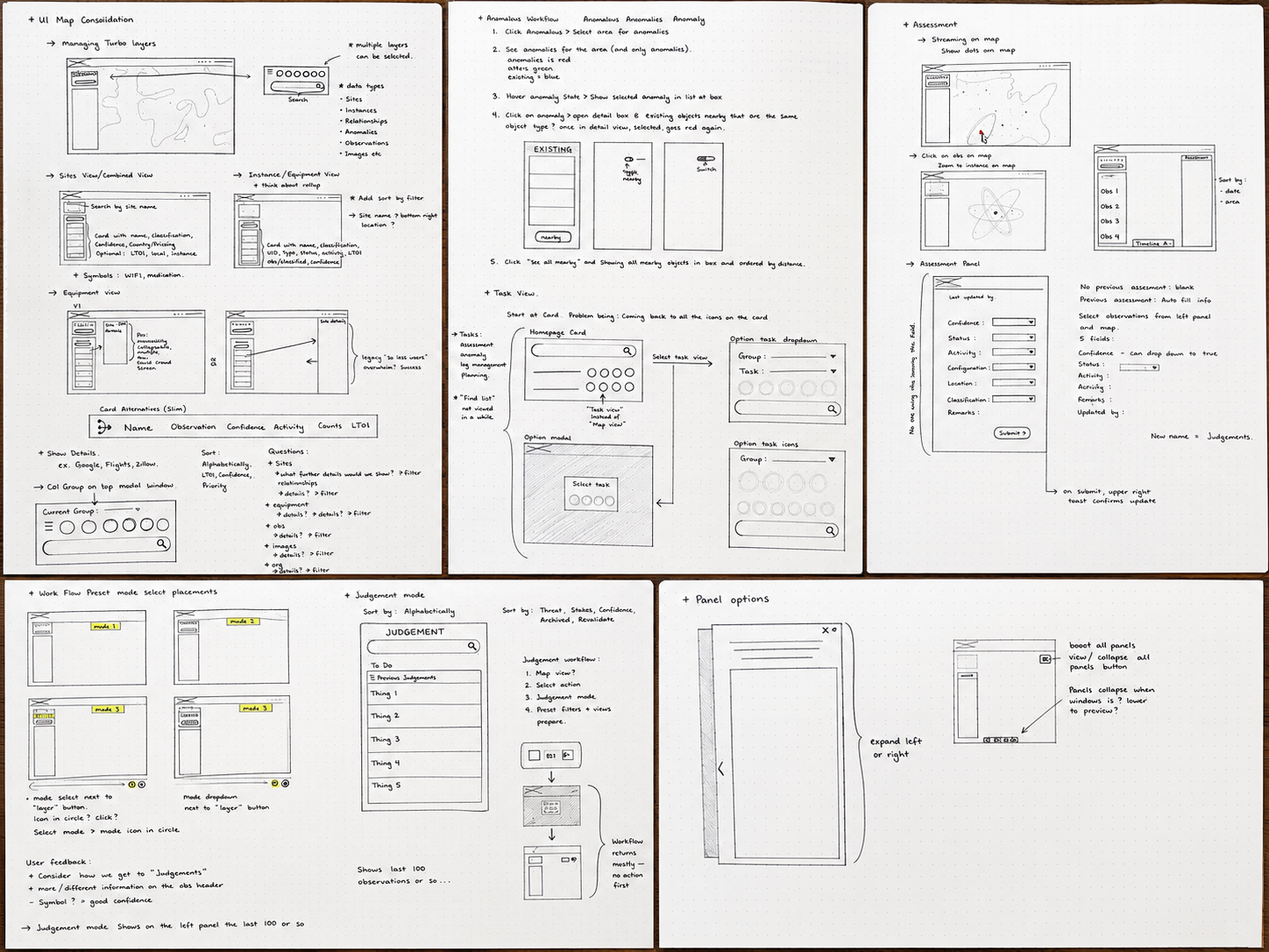
Over the course of the project, I explored dozens of concepts and created roughly sixty interface iterations, gradually refining a system that could support very different workflows without making them feel like separate products.
As the concepts developed, I focused on making the relationships between rules easier to follow without changing how the underlying logic worked.
Color-coded borders, alternating backgrounds, and clearer headers helped distinguish nested rule sets from individual rules. I also reorganized the controls so users could more easily follow each condition from its input through the operator and value, while keeping AND/OR relationships visible throughout the structure.
The goal wasn’t to remove complexity. It was to make that complexity easier to understand and work with, whether someone was building a simple rule or managing several layers of nested logic.
Clearer Rule Hierarchy
Color-coded borders, alternating backgrounds, and consistent headers make it easier to follow nested rule sets and understand which conditions belong together.
Simpler Rule Creation
More controls are available directly within the builder, reducing unnecessary steps and making individual conditions easier to create and edit.
Designed for Complex Logic
Collapsible rule sets, clearer AND/OR relationships, and compact value displays help keep complicated rules manageable as they grow.
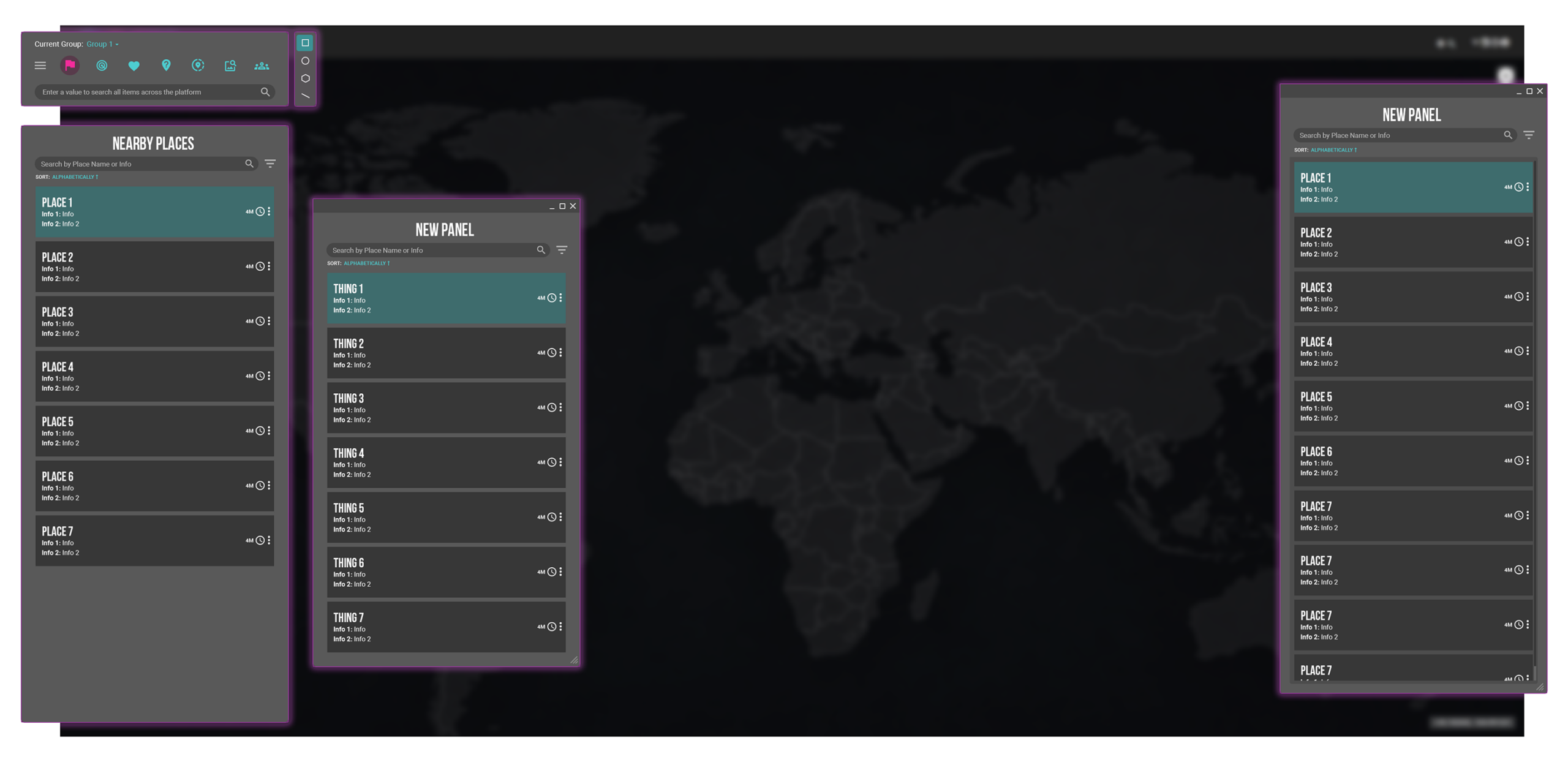
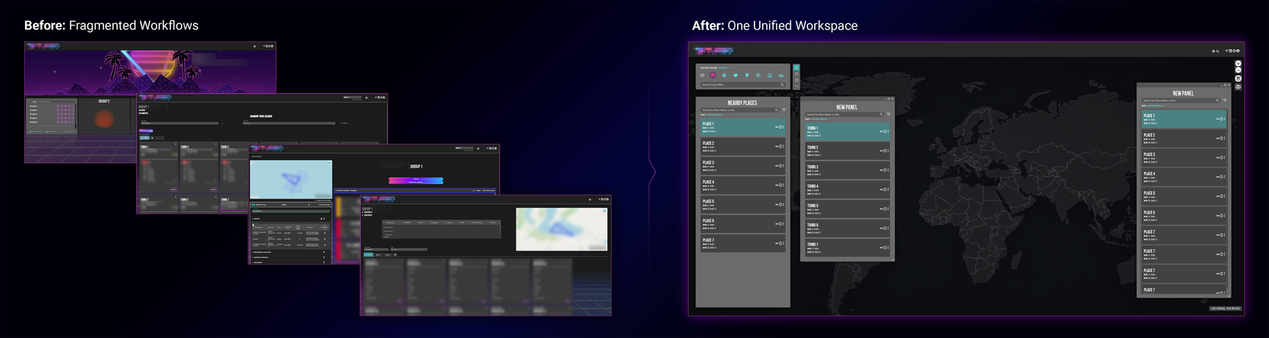
What began as an effort to bring eight siloed workflows together has become a shared foundation for the platform. Existing workflows continue to be brought into the unified experience, while new workflows can be designed within the same framework from the start.
The redesign has been extremely well received by users, creating a more cohesive and intuitive way to work while preserving the familiarity they had developed with the original workflows. As the platform continues to evolve, the system can grow with it without returning to the disconnected experiences it was designed to replace.